
How to make a website rank higher on Google
November 9, 2026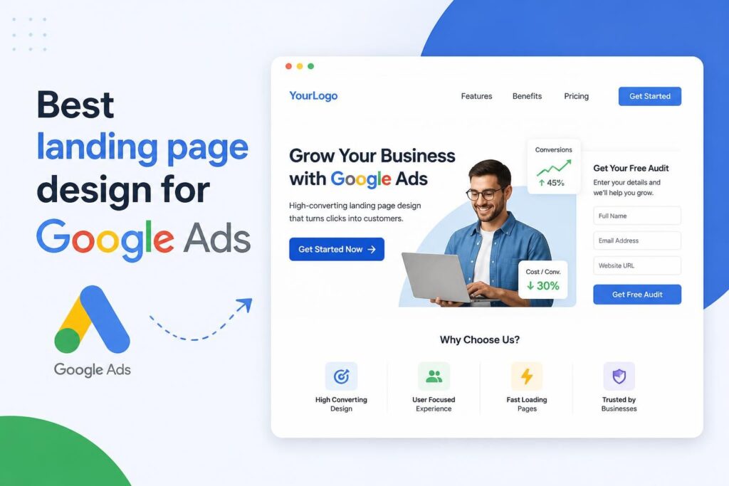




The best landing page design for Google Ads gives visitors a clear continuation of the advert they clicked. It matches the search term and ad message, explains the offer without unnecessary distractions, provides enough evidence to support a decision and presents one obvious next step. Every element should help a prospective customer understand the offer or complete the conversion.
A well-designed page can improve lead quality and reduce wasted ad spend, but appearance alone is not enough. Message relevance, mobile usability, page speed, conversion tracking and the quality of the offer all affect performance. South African businesses should also consider local buying behaviour, mobile data constraints and how customer information is collected and handled.
Explore Siteweb’s related digital marketing services
A landing page performs best when it forms part of a coordinated marketing system. Siteweb Online Marketing can assist with the following services:
- Google Ads campaign management for businesses seeking relevant search traffic and measurable enquiries.
- Search engine optimisation to build sustainable organic visibility alongside paid advertising.
- Google Business Profile optimisation for stronger local visibility and more accurate business information.
- Generative engine optimisation to improve how business information is understood by AI-assisted search tools.
- Social media marketing services that support brand awareness and audience engagement across relevant platforms.
What makes a Google Ads landing page effective?
An effective Google Ads landing page is relevant to the visitor’s search, focused on a single conversion goal, easy to use on a mobile phone and specific enough to answer the questions that could prevent an enquiry or purchase. It should not make visitors search through a general website to find the offer advertised.
Consider someone searching for an emergency plumbing service, a commercial accountant or an industrial equipment supplier. Each search suggests a different need and level of urgency. Sending all three audiences to a generic home page would force them to interpret broad company information before finding the relevant service. A dedicated landing page can address the exact need immediately.
The conversion goal should also reflect the decision being made. A call button may suit an urgent local service, while a detailed quote request may be appropriate for a technical business-to-business service. A high-value purchase may require specifications, case evidence and a consultation option before the visitor is ready to act.
Build the page around search intent and message match
Message match is the consistency between the user’s search, the Google ad and the landing page. If an advert promotes a specific service, location, product range or quotation offer, the page should make that same proposition visible near the top. A visitor should not have to guess whether the page is relevant.
Strong message match begins before the page is designed. Review the keywords and search themes in each ad group, then identify the promise made in the corresponding advert. Closely related searches can often share a page. Searches with materially different needs should usually have separate pages or tailored page variants.
What visitors should see first
The first screen should answer four practical questions: What is being offered? Is it relevant to my need? Why should I consider this business? What should I do next? The answer does not need to occupy the entire screen, but the main proposition and action should be apparent without a long introduction.
- A specific headline that reflects the service or offer advertised
- A short explanation of the result, scope or customer benefit
- A visible call to action that accurately describes the next step
- A relevant image, interface view or product visual where it adds clarity
- Concise trust information that can be verified
Avoid filling this area with sliders, several competing promotions or vague claims. Rotating banners can conceal important information and divide attention. One clear proposition is usually easier to understand and test.
Use a conversion-focused landing page structure
There is no universal layout that suits every campaign, but effective pages tend to present information in the order a buyer needs it. The sequence below is a practical starting point rather than a rigid template.
- State the offer. Use a headline and supporting copy that connect directly to the advert.
- Explain the value. Describe the problem solved, outcome provided or practical benefit of the service.
- Define the scope. Clarify what is included, who the offer is for and any relevant service-area or eligibility conditions.
- Provide evidence. Add genuine reviews, examples, credentials, process information or product details where available.
- Address objections. Answer realistic concerns about timing, process, suitability, commitments or what happens after an enquiry.
- Present the action. Repeat a clear call to action at logical decision points without placing buttons after every paragraph.
Longer pages are not automatically better or worse. A straightforward offer may convert with a compact page. A costly or complex service usually needs more explanation. The right length is the shortest page that answers the visitor’s meaningful questions without omitting information needed for a sound decision.
Write headlines and calls to action that set clear expectations
A landing page headline should describe the offer rather than merely announce the company. Phrases such as “Welcome to our website” use valuable space without confirming relevance. A stronger headline identifies the service, customer, location or outcome when those details matter to the search.
Calls to action work best when the wording reflects what happens next. “Submit” tells the visitor about the form mechanism, not the result. “Request a quotation”, “Book an assessment”, “Check availability” or “Speak to a consultant” provides more context. The business must then honour that expectation after the conversion.
Avoid manufacturing urgency or scarcity. Countdown timers, limited-space claims and instant-result promises should only appear when they are genuine and supportable. Clear expectations tend to produce more useful enquiries than pressure-driven wording that attracts clicks from people who do not understand the offer.
Reduce friction in lead-generation forms
Every form field creates work for the visitor, but removing all qualifying questions can leave a sales team with poor-quality leads. Ask only for information required to respond, route or assess the enquiry at that stage. A name, suitable contact method and brief description may be enough for many service businesses. Complex projects may justify fields for location, budget range, service type or timeframe.
Form design checks
- Use visible field labels rather than relying only on placeholder text.
- Explain the purpose of information that may feel sensitive.
- Display helpful error messages beside the relevant field.
- Use the correct mobile keyboard for phone numbers and email addresses.
- Make required and optional fields easy to distinguish.
- Confirm that the form works after theme, plugin or tracking changes.
- Provide a clear confirmation message and explain what happens next.
If telephone calls are important, make the number easy to tap on mobile devices and ensure calls can be answered during the stated operating period. A prominent phone number does not help if callers repeatedly reach an unattended line.
Design for mobile users before polishing desktop details
Many Google searches happen on mobile devices, and an advert can send the visitor to a page while they are travelling, comparing suppliers or using a limited data connection. Responsive design is only the starting point. The mobile version must remain readable, fast and easy to operate.
Buttons should be large enough to tap without hitting adjacent elements. Body text should not require zooming. Forms should fit the screen, and sticky call-to-action bars should not obscure the content or consent controls. Images need appropriate dimensions and compression rather than simply being shrunk visually by the browser.
Test the page on real devices where possible. A desktop browser’s mobile preview may not reveal keyboard behaviour, slow network performance, tap problems or layout changes caused by browser controls. Testing should include the form, telephone links, thank-you page and any payment or booking hand-off.
Page speed supports both usability and campaign performance
A slow landing page loses opportunities before the visitor can evaluate the offer. Common causes include oversized images, unnecessary video backgrounds, excessive tracking scripts, poorly configured plugins, third-party chat tools and heavy visual effects.
Google’s PageSpeed Insights can help identify technical performance problems, but a score should not replace hands-on testing. Check how quickly the main content becomes visible and usable on an ordinary mobile connection. Review performance again after adding analytics, advertising tags, consent tools or new WordPress plugins.
Practical improvements may include serving modern image formats, reserving image dimensions to reduce layout movement, loading non-critical media later and limiting third-party scripts. Removing a decorative feature that delays the offer can be more valuable than making several minor technical adjustments.
Trust signals must be specific and verifiable
Trust is not created by adding a row of generic icons. Useful evidence helps a visitor judge whether the business is suitable and whether the advertised promise is credible. Depending on the business, this could include authentic customer reviews, relevant project examples, detailed service processes, named product brands, accepted payment methods or clearly stated operating areas.
Only publish awards, memberships, customer logos, guarantees and performance claims that the business has permission and evidence to use. Testimonials should be genuine. If a result depends on circumstances outside the provider’s control, the page should not present it as guaranteed.
South African customers may also look for practical information such as service availability in their province or city, whether prices include VAT, which payment methods are accepted and how quickly the business normally responds. Include these details when they are accurate and relevant rather than adding location names simply to attract traffic.
Keep navigation focused without creating a dead end
A landing page often benefits from simpler navigation than a standard website page because the visitor arrived for a specific reason. This does not mean hiding the identity of the business or trapping the user. People may still need access to contact information, privacy details or supporting service information before they enquire.
Remove unrelated promotional banners and menu items that divert attention, but retain links that support trust and informed decision-making. The logo can link to the home page, while the footer can provide legitimate business and policy information. If the page is part of a broader site, its design should still look consistent with the brand shown in the advert.
Measure completed actions, not just page visits
A landing page cannot be improved reliably if conversions are not measured. Google Ads conversion tracking should record meaningful actions such as a completed enquiry, qualified phone call, booking or purchase. A button click is not always a completed lead; it may only show that someone opened a form or attempted a call.
Use a dedicated thank-you page or a reliable successful-form event where appropriate. Test the conversion from the original ad click through to confirmation, and check that refreshing a page does not create duplicate conversions. If call tracking is used, decide what call duration or outcome represents a meaningful enquiry for the business.
Google provides official guidance on setting up website conversion tracking. Tracking implementation should also respect applicable privacy requirements and the choices communicated to users. Avoid collecting information that is not needed for the stated purpose.
Test changes with a clear hypothesis
Randomly changing colours, headlines and button labels can produce data without producing insight. A useful landing page test begins with a problem supported by evidence. For example, mobile visitors may abandon a long form, or a high click-through rate may be followed by few enquiries because the page does not explain the service scope.
State the expected result before making the change: reducing the form from eight fields to five may increase completed enquiries without materially reducing lead quality. Run the test long enough to collect a meaningful sample, avoid changing unrelated campaign settings during the comparison and evaluate lead quality as well as conversion volume.
Businesses with limited traffic should prioritise obvious usability problems rather than running many small split tests. Form failures, poor mobile layouts, slow loading and a mismatch between the ad and page deserve attention before minor design preferences.
Common landing page mistakes that waste Google Ads traffic
- Sending every advert to the home page: visitors must search for the service they were promised.
- Using one page for unrelated keywords: the copy becomes broad and less persuasive for each audience.
- Adding several equal calls to action: competing actions make the intended next step unclear.
- Hiding the offer below company history: visitors need relevance before background information.
- Using stock imagery as proof: decorative images cannot replace genuine details or evidence.
- Requesting too much information: unnecessary fields create friction and privacy concerns.
- Failing to test forms: paid traffic continues even when an enquiry route is broken.
- Counting weak actions as leads: campaign reports can appear successful while sales receive few genuine enquiries.
- Ignoring post-conversion handling: slow or inconsistent follow-up can waste a well-generated lead.
A practical pre-launch checklist
Before directing budget to a new page, review the complete customer journey rather than approving the visual design in isolation.
- Confirm that the headline matches the keyword theme and advert.
- Check that the offer, audience and service area are unambiguous.
- Complete every form and action on desktop and mobile.
- Test telephone, email, booking and payment links where applicable.
- Review spelling, factual claims, pricing details and contact information.
- Compress large media and assess loading performance.
- Verify conversion tracking and prevent duplicate recording.
- Check the thank-you message and expected response process.
- Ensure privacy information and consent controls match the data collected.
- Assign responsibility for monitoring leads, campaign data and page errors after launch.
Questions business owners often ask about Google Ads landing pages
Should Google Ads send visitors to a home page or landing page?
A dedicated landing page is usually the better choice when the advert promotes a particular service, product, location or offer. A home page may be suitable for branded searches or broad company research, but it often contains too many messages for a focused advertising campaign.
How many calls to action should a landing page have?
The page should normally focus on one primary conversion goal, although the same action can appear in several appropriate places. A secondary contact method, such as a telephone number, can support the main goal if it serves the same intent rather than competing with it.
Does a landing page need a menu?
Not always. A campaign page can use reduced navigation to keep attention on the offer. It should still provide enough business, contact and policy information for visitors to verify who they are dealing with and make an informed decision.
How often should a Google Ads landing page be updated?
Review the page whenever the offer, campaign targeting, service details or customer questions change. It should also be checked regularly for broken forms, tracking problems, outdated claims and mobile usability issues. Changes should be based on evidence rather than a fixed redesign schedule.
Can one landing page be used for several ad groups?
Yes, when the ad groups represent closely related searches with the same intent and offer. Separate pages are preferable when visitors expect different services, locations, pricing models or levels of detail. Relevance should determine the page structure, not convenience alone.
Turn paid clicks into measurable business enquiries
The best landing page design for Google Ads is not the page with the most animation or the shortest form. It is the page that accurately continues the advert’s promise, removes avoidable friction, supports a confident decision and records the resulting action correctly. That requires coordination between campaign targeting, copy, design, development, tracking and lead follow-up.
Siteweb Online Marketing can help assess how your Google Ads campaigns and landing pages work together, identify conversion barriers and develop a clearer path from search to enquiry. Contact Siteweb Online Marketing to discuss improving lead generation from your paid search traffic.