
Is SEO still worth it for small businesses
August 14, 2026
How to get your business mentioned in ChatGPT
August 24, 2026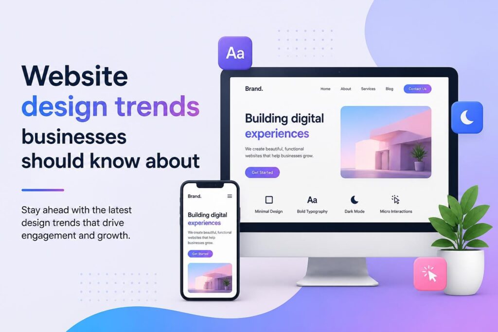





Website design trends are moving away from decorative novelty and towards measurable business value. For South African business owners, a modern website must load quickly, communicate clearly, work on a mobile phone and guide visitors towards a useful next step. A polished appearance still matters, but it cannot compensate for confusing navigation, weak content or an enquiry process that creates friction.
The best trends are not features to copy blindly. They are responses to changes in customer behaviour, search technology, accessibility expectations and device performance. Before redesigning a site, businesses should assess which changes will improve trust, brand recognition, lead quality or conversion rates. This guide explains the website design trends businesses should know about and how to apply them without sacrificing usability.
Build visibility beyond your website
A well-designed website is more effective when it forms part of a coordinated marketing system. Siteweb Online Marketing helps businesses connect their websites with the channels customers use to discover, compare and contact service providers.
- Google Business Profile optimisation can strengthen visibility for relevant local searches.
- Google Ads campaign management can bring high-intent visitors to focused landing pages.
- Search engine optimisation services can improve site structure, content relevance and organic visibility.
- Generative engine optimisation can make business information easier for AI-powered search systems to interpret and reference.
- Social media marketing can extend brand reach and direct relevant audiences to the website.
1. Purposeful simplicity is replacing empty minimalism
Minimal design has been popular for years, but the more useful development is purposeful simplicity. A sparse page is not automatically easy to use. If important information is hidden behind vague icons, oversized images or unconventional menus, visual minimalism can make the customer journey harder.
Purposeful simplicity removes elements that do not help the visitor understand the offer or take action. It uses descriptive headings, short navigation labels, readable paragraphs and clear distinctions between primary and secondary actions. Space is used to improve comprehension rather than to create an artistic effect.
For a service business, a purposeful homepage should quickly establish what the company does, who it serves and where it operates. The page can then support that message with proof, service summaries, useful resources and an obvious route to enquire. This approach is especially valuable on mobile screens, where every unnecessary element competes for limited space.
2. Distinctive brand systems are overtaking generic templates
Many business websites share the same visual pattern: a full-width stock photograph, a broad claim, three service cards and a brightly coloured button. The layout may be functional, but it rarely builds a memorable brand. A growing design priority is to create a consistent visual system rather than rely on a generic theme with a logo placed at the top.
A practical brand system includes a restrained colour palette, typography rules, image treatments, icon styles, button conventions and reusable page components. These elements should remain recognisable across the website, social media graphics, advertisements and sales documents. Consistency helps visitors recognise the business and reduces the fragmented appearance that develops when every page is designed separately.
Distinctiveness does not require unusual navigation or dramatic animation. It can come from original photography, a specific editorial tone, custom illustrations or a consistent use of colour and spacing. The goal is recognition without making the interface difficult to use.
3. Mobile-first design now means designing for real constraints
Mobile-first design is more than making desktop columns stack vertically. It requires decisions based on smaller screens, touch controls, variable connection quality and the circumstances in which people use their phones. A visitor may be comparing suppliers while travelling, trying to find a phone number quickly or completing a form without access to a physical keyboard.
A strong mobile experience should include:
- Readable text without pinch-to-zoom.
- Buttons and links with enough space for accurate tapping.
- Navigation that exposes important sections without several nested menus.
- Forms that request only information needed for the next step.
- Images sized and compressed for the device on which they are displayed.
- Contact options that work naturally on a phone, such as tap-to-call links.
Businesses should test important pages on actual devices rather than relying only on a browser preview. Check the homepage, service pages, contact process, menus, pop-ups and confirmation messages. A form that technically fits on a small screen may still be frustrating if fields are difficult to select or an on-screen keyboard covers the submit button.
4. Performance is becoming part of the visual design process
Website speed cannot be left until the development phase. Design decisions influence file sizes, script usage and how quickly the main content appears. Video backgrounds, multiple font families, large image sliders and third-party widgets may look impressive in a design presentation but create a slow experience once the page is live.
Google’s Core Web Vitals guidance focuses on loading performance, responsiveness and visual stability. These measures do not replace broader usability testing, but they provide useful indicators of whether a page feels stable and responsive to visitors.
Design and development teams should agree on a performance budget before building complex pages. That may include limits for image weight, font files, tracking scripts and interactive components. Modern image formats, responsive image sizes, browser caching and careful script loading can help, but the simplest improvement is often to remove components that deliver little customer value.
5. Accessibility is influencing mainstream website design
Accessible design helps people perceive, understand and operate a website across different abilities, devices and situations. It also tends to improve the experience for everyone. Clear labels, sufficient colour contrast, keyboard access and logical heading structures are useful to a person using assistive technology and to a visitor completing a task under difficult viewing conditions.
The Web Content Accessibility Guidelines 2.2 provide recognised criteria for accessible web content. Businesses planning a new website should discuss accessibility at the design and content stages rather than treating it as a final technical check.
Accessibility details that are often missed
- Using colour as the only way to communicate an error or status.
- Placing text over photographs without reliable contrast.
- Removing visible keyboard focus indicators for aesthetic reasons.
- Publishing images of text instead of live, selectable text.
- Adding videos without captions or an equivalent text explanation.
- Writing form instructions that disappear once a user begins typing.
Automated testing can identify some problems, but it cannot fully assess whether navigation is understandable or alternative text is meaningful. Manual keyboard testing and reviews by people familiar with accessibility should form part of quality assurance.
6. Motion is becoming quieter and more functional
Animation is most effective when it explains a change, confirms an action or helps visitors understand the relationship between interface elements. Small transitions can show that a form was submitted, a menu opened or new content loaded. Motion becomes a problem when it delays access, distracts from the message or continues without user control.
Respecting reduced-motion preferences is a sensible design practice. Background video should not be the only way important information is communicated, and automatically moving carousels should allow visitors to pause or control them. Businesses should ask what each animation communicates. If the answer is simply that it makes the page feel modern, it may not justify the performance and accessibility cost.
7. Modular pages make websites easier to maintain
A modular website uses a defined set of flexible content sections that can be combined to create pages without rebuilding layouts from scratch. Examples include service introductions, testimonial panels, process sections, comparison tables, related resources and calls to action.
This approach creates consistency while allowing enough variation for different page purposes. It also reduces the temptation to solve every content request with a new plugin or custom layout. For growing businesses, modular design can make routine updates faster and reduce visual inconsistencies between old and new pages.
The modules should not dictate the message. Content planning comes first, followed by selection of the component that presents that information clearly. If every page contains the same sections in the same order, the site can feel repetitive and may fail to answer the specific questions associated with each service.
8. Conversion-focused design is reducing enquiry friction
A conversion-focused website does not pressure every visitor into an immediate sale. It provides suitable next steps for people at different stages of research. Someone comparing providers may want a detailed service explanation or case study, while a ready buyer may want to call or request a quotation.
Good calls to action describe what will happen next. Labels such as “Request a consultation” or “Discuss your website project” communicate more than a generic “Submit” button. Forms should ask for enough information to qualify the enquiry without creating unnecessary work for the visitor.
Trust information should appear near the decision it supports. This may include a clear process, genuine customer feedback, answers to common concerns, business contact details or examples of completed work where available. Avoid unsupported claims, invented urgency and counters that cannot be verified. These tactics may attract attention, but they can weaken confidence in the brand.
9. Content-led layouts support search and decision-making
Modern website design should accommodate substantial, useful content without turning every page into a wall of text. The layout needs to support scanning while preserving enough explanation for visitors making a considered purchase.
Descriptive headings, concise summaries, comparison tables and expandable details can help organise complex information. The key is not to hide every answer behind an interaction. Search engines and visitors both benefit when the central subject of a page is clear and the important information is available in the page content.
Service pages should answer practical questions: what the service includes, who it is for, how the process works, what influences scope and what the customer should prepare. Thin pages designed around a single phrase rarely provide enough evidence for a business owner deciding whom to contact.
10. AI-assisted interfaces need a clear customer benefit
AI-assisted search, support and personalisation are appearing on more websites, but implementation should begin with a defined user problem. A chatbot may help visitors find relevant information outside office hours. It may also frustrate them if it provides vague answers, blocks the page or pretends to be a person.
Businesses using automated interfaces should state what the tool can do, provide a route to human assistance and review the quality of its answers. Sensitive or personal information should not be requested without a valid purpose and appropriate handling procedures. In South Africa, website data collection and direct marketing processes should be reviewed with the Protection of Personal Information Act and guidance from the Information Regulator in mind. Legal advice may be needed for a business’s specific circumstances.
AI search also affects how website content is structured. Clear business details, explicit service descriptions, consistent terminology and well-organised supporting information are easier for both people and automated systems to interpret. This is not a replacement for SEO; it extends the need for accurate, useful and technically accessible content.
11. Privacy-aware measurement is changing analytics design
Website owners still need to understand which pages attract useful visits and where prospective customers abandon a process. The trend is towards collecting information with a specific business purpose rather than installing every available tracker.
Before adding analytics, advertising pixels, session recording or embedded third-party tools, identify what decision the data will support. Consent notices should not be designed to confuse people into accepting optional tracking. Forms should explain why information is requested, and access to submissions should be restricted to people who need it.
A practical measurement plan can focus on meaningful events such as completed enquiries, telephone link clicks, quotation requests and visits to high-value service pages. Large volumes of page-view data are less useful if the business cannot connect them to customer behaviour or marketing decisions.
How to decide which website trends suit your business
Trends should be filtered through customer needs, brand positioning and commercial goals. A professional services firm, an online retailer and a local contractor may all need fast mobile websites, but their content structures and conversion paths will differ.
- Define the business outcome. Decide whether the project needs to generate enquiries, sell products, reduce support requests, improve recruitment or strengthen brand credibility.
- Review customer tasks. Identify what visitors need to find, compare or complete before contacting the business.
- Audit current evidence. Examine analytics, search queries, form submissions, sales questions and customer feedback instead of relying on aesthetic preferences alone.
- Prioritise structural problems. Fix unclear positioning, navigation, mobile usability, accessibility and performance before adding decorative features.
- Prototype important journeys. Test how a visitor moves from a landing page to a service explanation and then to an enquiry.
- Measure after launch. Track qualified actions and review whether the redesigned pages support the intended outcome.
This process also helps control project scope. A business may discover that it needs better service content and a simpler enquiry path rather than a complete visual rebuild.
Website design mistakes that quickly date a business
Some design choices age badly because they depend on novelty rather than usefulness. Others create avoidable barriers that make a capable business appear less credible.
- Copying a competitor’s layout without considering a different audience or sales process.
- Using stock photographs that do not reflect the service, team or South African market.
- Putting the company story before explaining what the customer can obtain.
- Hiding contact details behind several navigation steps.
- Installing pop-ups that interrupt visitors before they have read the page.
- Using low-contrast text, small type or long centred paragraphs.
- Launching a redesign without redirects, metadata checks or search performance monitoring.
- Choosing effects that cannot be used comfortably on a mobile device.
A redesign can also damage organic visibility if valuable pages are removed or their URLs change without a migration plan. Existing rankings, internal links, backlinks and high-performing content should be documented before development begins. Design, content and SEO decisions need to be coordinated rather than handled as separate projects.
What to ask a website design or marketing provider
A useful proposal should explain more than colours, page counts and visual references. Ask prospective providers how they will connect design decisions to business goals and how success will be evaluated.
- How will customer research and search behaviour inform the site structure?
- What is included in content planning, writing and migration?
- How will mobile usability, accessibility and performance be tested?
- Who owns the website, content, design files and accounts after launch?
- How are redirects and existing search rankings handled during a redesign?
- Which analytics events will be configured?
- What ongoing maintenance, security and marketing work will be required?
Businesses should also establish who approves content, supplies imagery and responds to technical questions. Delays often occur when responsibilities are unclear rather than because the design work itself is unusually complex.
Questions business owners ask about website design trends
How often should a business website be redesigned?
There is no universal redesign schedule. A redesign is justified when the website no longer reflects the business, performs poorly on current devices, creates customer friction or cannot support required content and marketing activity. Regular improvements are often more cost-effective than replacing an entire site purely because its visual style is a few years old.
Which website design trend matters most for lead generation?
Clear conversion paths usually have more impact than decorative trends. Visitors need to understand the service, see credible supporting information and know what to do next. Mobile usability, fast loading, focused landing pages and short, well-designed enquiry forms all support lead generation.
Should every business add a chatbot to its website?
No. A chatbot is useful only when it solves a recurring customer problem and its answers can be maintained. Businesses should provide clear limits, protect personal information and offer a human contact option. A searchable FAQ or improved navigation may solve the same problem with less complexity.
Can a visually modern website improve SEO?
Visual style alone does not improve search rankings. A redesign can support SEO when it improves content organisation, internal linking, mobile usability, speed and accessibility. It can harm visibility if useful content is removed, URLs are changed carelessly or important text is replaced with images and unsupported interactive elements.
What should a South African business prioritise on a new website?
Start with clear service and location information, reliable mobile performance, accessible content, trustworthy contact details and a straightforward enquiry process. Data collection and marketing tools should be implemented with privacy requirements in mind. The final priorities should reflect the business’s customers and how they prefer to research and make contact.
Turn design improvements into measurable marketing results
The website design trends worth adopting are the ones that make a business easier to recognise, understand and contact. Purposeful simplicity, stronger brand systems, mobile usability, accessible interfaces, useful content and careful performance choices support both customer experience and marketing efficiency. Decorative treatments should strengthen those foundations rather than distract from them.
Siteweb Online Marketing can help assess how your website, search visibility, paid campaigns, local presence and social channels work together to generate leads. If your current site looks dated, attracts the wrong enquiries or fails to turn visits into meaningful actions, contact Siteweb to discuss practical improvements based on your business goals.